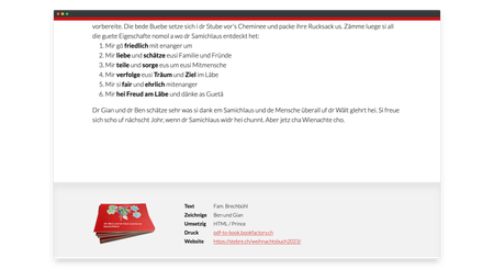
Christmas book and the resulting md-book-with-docraptor repository
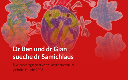
With the personal CSS paged media project we made our own Christmas story into a present. It was converted into a PDF with the Prince Renderer and printed. The story can also be read digitally as a responsive website [not translated to English].
Idea
We came up with a Christmas story as a Christmas present this year. The story “Dr Ben und dr Gian sueche dr Samichlaus” was decorated with drawings by our two sons.
The aim was a Content First implementation, so that a single data basis can be used for both a printed book and a website. The content is written in Markdown - i.e. plain text files.
Prince
With the Markdown files I created, I could have implemented the book in InDesign or another layout program, as I wrote down a while ago in Cross-media text processing with Markdown.
However, I wanted to solve it with the PDF Renderer Prince – even if I had to spend a lot more time with it 😅. In addition to wanting to dig deeper and learn from it, the idea was to create a basis for future projects. The strength of CSS paged media is in repetition and standardized output.
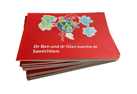
md-book-with-docraptor
Although I finally rendered the content and the cover with the locally installed Prince, two Node.js scripts were created with this book, which I make available in the repository md-book-with-docraptor on Github.
I will not describe the two scripts in detail here. In short, md2html.js converts the Markdown files into several HTML files and docraptor.js sends the HTML files, which contain the CSS code and assets inline, to docraptor.com. DocRaptor is an online service with an API to use Prince in the cloud.
Web export
Of course, layouting with CSS also calls for a screen-optimized version in the shape of a website. The HTML files created are used to achieve both print and web output. The CSS rules make the difference. With the use of CSS variables, the end result can be customized. The page geometries, bleed, colors, fonts, etc. can be defined at the beginning of general.css.
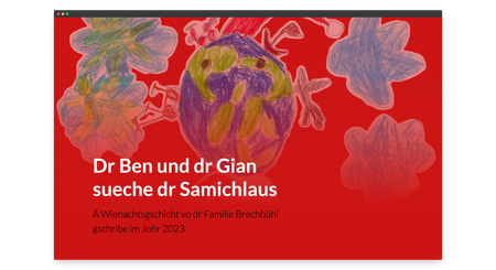
The website starts with a full-screen title area with the cover image as the background.
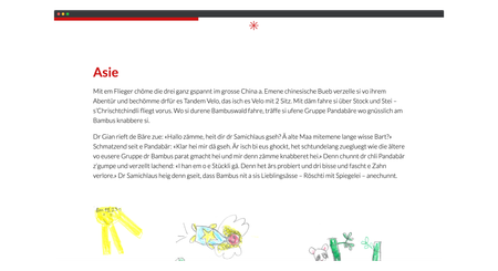
A separator character can be selected between the individual chapters. I have chosen the star glyph. While scrolling, the progress is displayed with a bar at the top in the accent color.
The imprint, which appears in the book at the beginning in the content section, is displayed in the footer area of the website.
